After several recommendations I wanted to give next-themes a try. In this post I'll cover adding it along with Tailwind CSS to a Next.js website. A demo of what we will be building: https://dlw-nextjs-themes-tailwindcss-dark-mode.vercel.app/
Nextjs Setup
To get started the easiest way is to use create react app, full getting started instructions can be found on the Next.js website
npx create-next-app
# or
yarn create next-app
Next themes
For controlling which theme is shown we'll use next-themes. Install the dependency using your prefered package manager:
npm install next-themes
# or
yarn add next-themes
If you haven't already add a custom app component, Create-next-app will do this automatically. Now wrap Component component in the theme provider exported from next-themes with a property called attribute and a value of class
import { ThemeProvider } from 'next-themes';

function MyApp({ Component, pageProps }) {
  return (
    <ThemeProvider attribute="class">
      <Component {...pageProps} />
    </ThemeProvider>
  );
}

export default MyApp;
We need a way to change our theme. Add a new directory called components with the following:
import { useEffect, useState } from 'react';
import { useTheme } from 'next-themes';

const ThemeChanger = () => {
  const [mounted, setMounted] = useState(false);
  const { theme, setTheme } = useTheme();

  // When mounted on client, now we can show the UI
  useEffect(() => setMounted(true), []);

  if (!mounted) return null;

  return (
    <div className="p-8 bg-gray-200 flex justify-between items-center font-bold text-xl">
      The current theme is: {theme}
      <div>
        <button className="hover:text-orange-600" onClick={() => setTheme('light')}>
          <svg
            className="w-8 h-8"
            fill="none"
            stroke="currentColor"
            viewBox="0 0 24 24"
            xmlns="http://www.w3.org/2000/svg"
          >
            <path
              strokeLinecap="round"
              strokeLinejoin="round"
              strokeWidth={2}
              d="M12 3v1m0 16v1m9-9h-1M4 12H3m15.364 6.364l-.707-.707M6.343 6.343l-.707-.707m12.728 0l-.707.707M6.343 17.657l-.707.707M16 12a4 4 0 11-8 0 4 4 0 018 0z"
            />
          </svg>
        </button>
        <button className="ml-4 hover:text-orange-600" onClick={() => setTheme('dark')}>
          <svg
            fill="none"
            viewBox="0 0 24 24"
            stroke="currentColor"
            id="moon"
            class="w-8 h-8 text-cool-gray-800 dark:text-cool-gray-200 group-hover:text-purple-600 group-focus:text-purple-600 dark:group-hover:text-purple-50 dark:group-focus:text-purple-50"
          >
            <path
              stroke-linecap="round"
              stroke-linejoin="round"
              stroke-width="2"
              d="M20.354 15.354A9 9 0 018.646 3.646 9.003 9.003 0 0012 21a9.003 9.003 0 008.354-5.646z"
            ></path>
          </svg>
        </button>
      </div>
    </div>
  );
};

export default ThemeChanger;
As Nextjs is SSR (server-side rendered) or SSG (static site generated) we don't know the theme on the server, therefore, we add a check to see if the component is mounted:
// When mounted on client, now we can show the UI
useEffect(() => setMounted(true), []);

if (!mounted) return null;
If not it returns null ensuring the UI uses the current theme once the page is mounted on the client.
Also the theme changer component includes some Tailwind CSS classes which we'll set up next. These aren't important, the main thing of note is the useTheme hook and onClick handler for setting the theme.
The svg icons are courtesy of Heroicons.
Tailwind CSS
Now to set up Tailwind CSS
# If you're on Next.js v10
npm install tailwindcss@latest postcss@latest autoprefixer@latest
# or
yarn add tailwindcss@latest postcss@latest autoprefixer@latest
Run the following to generate the tailwind.config.js and postcss.config.js files:
npx tailwindcss init -p
When complete set darkMode to 'class' in the tailwind.config.js
module.exports = {
  purge: ['./pages/**/*.{js,ts,jsx,tsx}', './components/**/*.{js,ts,jsx,tsx}'],
  darkMode: class, // or 'media' or 'class'
  theme: {
    extend: {},
  },
  variants: {
    extend: {},
  },
  plugins: [],
}
This is how Tailwind CSS switches the styles. Also, notice the purge options which will remove any unused classes in our production build.
Demo page
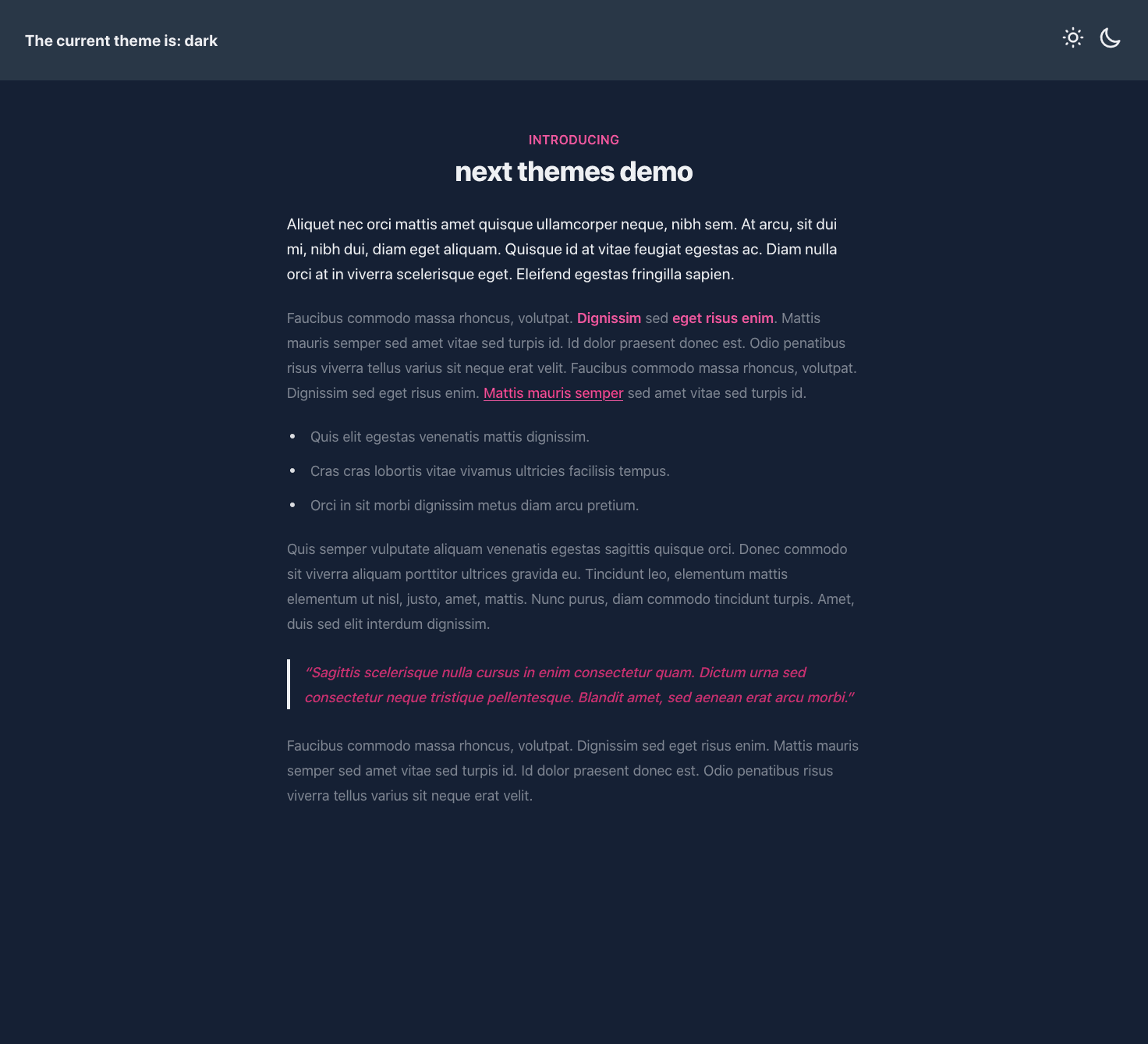
Replace /pages/index.js with the following content:
import ThemeChanger from '../components/ThemeChanger';

export default function Home() {
  return (
    <div className="antialiased font-sans text-gray-500 dark:text-gray-200 bg-white dark:bg-gray-900 w-full">
      <ThemeChanger />

      <div className="relative py-16">
        <div className="relative px-4 sm:px-6 lg:px-8">
          <div className="text-lg max-w-prose mx-auto">
            <h1>
              <span className="block text-base text-center text-orange-600 dark:text-pink-500 font-semibold tracking-wide uppercase">
                Introducing
              </span>
              <span className="mt-2 block text-3xl text-center leading-8 font-extrabold tracking-tight text-gray-900 dark:text-gray-100 sm:text-4xl">
                next themes demo
              </span>
            </h1>
            <p className="mt-8 text-xl leading-8">
              Aliquet nec orci mattis amet quisque ullamcorper neque, nibh sem. At arcu, sit dui mi, nibh dui, diam eget
              aliquam. Quisque id at vitae feugiat egestas ac. Diam nulla orci at in viverra scelerisque eget. Eleifend
              egestas fringilla sapien.
            </p>
          </div>
          <div className="mt-6 mx-auto">
            <p>
              Faucibus commodo massa rhoncus, volutpat. <strong>Dignissim</strong> sed <strong>eget risus enim</strong>.
              Mattis mauris semper sed amet vitae sed turpis id. Id dolor praesent donec est. Odio penatibus risus
              viverra tellus varius sit neque erat velit. Faucibus commodo massa rhoncus, volutpat. Dignissim sed eget
              risus enim. <a href="#">Mattis mauris semper</a> sed amet vitae sed turpis id.
            </p>
            <ul>
              <li>Quis elit egestas venenatis mattis dignissim.</li>
              <li>Cras cras lobortis vitae vivamus ultricies facilisis tempus.</li>
              <li>Orci in sit morbi dignissim metus diam arcu pretium.</li>
            </ul>
            <p>
              Quis semper vulputate aliquam venenatis egestas sagittis quisque orci. Donec commodo sit viverra aliquam
              porttitor ultrices gravida eu. Tincidunt leo, elementum mattis elementum ut nisl, justo, amet, mattis.
              Nunc purus, diam commodo tincidunt turpis. Amet, duis sed elit interdum dignissim.
            </p>
            <blockquote>
              <p>
                Sagittis scelerisque nulla cursus in enim consectetur quam. Dictum urna sed consectetur neque tristique
                pellentesque. Blandit amet, sed aenean erat arcu morbi.
              </p>
            </blockquote>
            <p>
              Faucibus commodo massa rhoncus, volutpat. Dignissim sed eget risus enim. Mattis mauris semper sed amet
              vitae sed turpis id. Id dolor praesent donec est. Odio penatibus risus viverra tellus varius sit neque
              erat velit.
            </p>
          </div>
        </div>
      </div>
    </div>
  );
}
Notice how various classes are prefixed with 'dark:' for example:
text-gray-500 dark:text-gray-200
When clicking our theme buttons the dark prefix will be activated if a .dark class is found higher up in the HTML tree (and vica-versa). If you haven't already, start the dev server to see it in action:
npm run dev
And go to http://localhost:3000, we can not switch between the two themes. We do have unstyled HTML which we'll fix next.
tailwind TYPOGRAPHY
tailwind TYPOGRAPHY provides a set of default styling to any HTML or Markdown you don't control, for example, content pulled from a CMS.
To install the plugin, run:
# Using npm
npm install @tailwindcss/typography

# Using Yarn
yarn add @tailwindcss/typography
Then update the tailwind.config.js, adding the plugin and specifying the dark variant for typography property. The latter config setting as caught me out a couple of times. Without that our prose-dark styles won't be applied
module.exports = {
  purge: ['./pages/**/*.{js,ts,jsx,tsx}', './components/**/*.{js,ts,jsx,tsx}'],
  darkMode: 'class',
  theme: {
  },
  variants: {
    typography: ['dark'],
  },
  plugins: [
    require('@tailwindcss/typography'),
  ],
}
I also added some styling for the typography plugin to use and extending the default colour palette. My final tailwind.config.js file looks like the following:
const colors = require('tailwindcss/colors');

module.exports = {
  purge: ['./pages/**/*.{js,ts,jsx,tsx}', './components/**/*.{js,ts,jsx,tsx}'],
  darkMode: 'class',
  theme: {
    extend: {
      colors: {
        orange: colors.orange,
      },
      typography: (theme) => ({
        DEFAULT: {
          css: {
            color: theme('colors.gray.500'),
            strong: {
              color: theme('colors.orange.500'),
            },
            blockquote: {
              color: theme('colors.orange.700'),
            }
          },
        },
        dark: {
          css: {
            color: theme('colors.gray.500'),
            strong: {
              color: theme('colors.pink.500'),
            },
            blockquote: {
              color: theme('colors.pink.700'),
            }
          },
        },
      }),
    },
  },
  variants: {
    typography: ['dark'],
  },
  plugins: [
    require('@tailwindcss/typography'),
  ],
}
Feel free to use different colours, and extend the HTML elements typography applies custom colours/styles to.
Back to the /pages/index.js page to add the necessary prose classes. Around line 17 update the parent content div from:
<div className="mt-6 mx-auto">
  <p>Faucibus commodo massa rhoncus, volutpat. <strong>Dignissim</strong> sed <strong>eget risus enim</strong>. Mattis mauris semper sed amet vitae sed turpis id. Id dolor praesent donec est. Odio penatibus risus viverra tellus varius sit neque erat velit. Faucibus commodo massa rhoncus, volutpat. Dignissim sed eget risus enim. <a href="#">Mattis mauris semper</a> sed amet vitae sed turpis id.</p>
  <ul>
    <li>Quis elit egestas venenatis mattis dignissim.</li>
    <li>Cras cras lobortis vitae vivamus ultricies facilisis tempus.</li>
    <li>Orci in sit morbi dignissim metus diam arcu pretium.</li>
  </ul>
  <p>Quis semper vulputate aliquam venenatis egestas sagittis quisque orci. Donec commodo sit viverra aliquam porttitor ultrices gravida eu. Tincidunt leo, elementum mattis elementum ut nisl, justo, amet, mattis. Nunc purus, diam commodo tincidunt turpis. Amet, duis sed elit interdum dignissim.</p>
  <blockquote>
    <p>Sagittis scelerisque nulla cursus in enim consectetur quam. Dictum urna sed consectetur neque tristique pellentesque. Blandit amet, sed aenean erat arcu morbi.</p>
  </blockquote>
  <p>Faucibus commodo massa rhoncus, volutpat. Dignissim sed eget risus enim. Mattis mauris semper sed amet vitae sed turpis id. Id dolor praesent donec est. Odio penatibus risus viverra tellus varius sit neque erat velit.</p>
</div>
To:
<div className="mt-6 prose prose-orange dark:prose-dark dark:prose-pink prose-lg mx-auto">
  <p>Faucibus commodo massa rhoncus, volutpat. <strong>Dignissim</strong> sed <strong>eget risus enim</strong>. Mattis mauris semper sed amet vitae sed turpis id. Id dolor praesent donec est. Odio penatibus risus viverra tellus varius sit neque erat velit. Faucibus commodo massa rhoncus, volutpat. Dignissim sed eget risus enim. <a href="#">Mattis mauris semper</a> sed amet vitae sed turpis id.</p>
  <ul>
    <li>Quis elit egestas venenatis mattis dignissim.</li>
    <li>Cras cras lobortis vitae vivamus ultricies facilisis tempus.</li>
    <li>Orci in sit morbi dignissim metus diam arcu pretium.</li>
  </ul>
  <p>Quis semper vulputate aliquam venenatis egestas sagittis quisque orci. Donec commodo sit viverra aliquam porttitor ultrices gravida eu. Tincidunt leo, elementum mattis elementum ut nisl, justo, amet, mattis. Nunc purus, diam commodo tincidunt turpis. Amet, duis sed elit interdum dignissim.</p>
  <blockquote>
    <p>Sagittis scelerisque nulla cursus in enim consectetur quam. Dictum urna sed consectetur neque tristique pellentesque. Blandit amet, sed aenean erat arcu morbi.</p>
  </blockquote>
  <p>Faucibus commodo massa rhoncus, volutpat. Dignissim sed eget risus enim. Mattis mauris semper sed amet vitae sed turpis id. Id dolor praesent donec est. Odio penatibus risus viverra tellus varius sit neque erat velit.</p>
</div>
Adding in prose prose-orange dark:prose-dark dark:prose-pink prose-lg. A final change is to add some styles to global/styles.css to ensure the background colour is full width and height, no matter the resolution viewing:
/* ./styles/globals.css */
@tailwind base;
@tailwind components;
@tailwind utilities;

html,
body {
  height: 100%;
  display: flex;
}

#__next {
  height: 100%;
  grid-row: 1/-1;
  grid-column: 1/-1;
}
The final page should look something like the following:


Cookies = Bad
As a final thought, I did look into using cookies to stop having to check if the component was mounted. The author of next-themes covers this in one of his comments on an issue pointing out the downside of cookies over local storage:
- Forces your pages to be SSR, which alone causes more performance issues than a 2-3ms script does
- Does not support SSG pages
- You will still need a blocking script to support System theme (for full support at least)
- Cookie parsing/setting is more verbose than localStorage, likely requiring a 5kb+ library
The full thread can be seen here https://github.com/pacocoursey/next-themes/issues/17